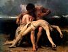
San Francisco (Be Sure To Wear Something Dead In Your Hair)
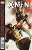
Poor San Francisco seems to be the worst-hit city. So I tried an experiment. I took a picture of San Francisco from the X-Men:
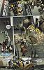 Curse of the Mutants #2: Dreary, but at least it isn't orange. Well, maybe a bit.
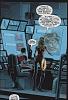
Then I took a picture of San Francisco from the Teen Titans:
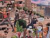 #88: The orange wash here is at least subtle; but compare their jeans to your own. Do they really look that colour?
Then I took a picture of San Francisco:
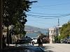 Note the colour scheme; blue sky, vibrant colours
green.
That's hardly fair. That issue of Teen Titans is set in the evening. Light is orange then.
"There's always a canal, or an inlet, or a fjord."
Okay, so I went through a few earlier issues of Titans:
Those are from 72, 71 (late evening! Not orange, just very dark blue), 71 again (orange) and 69.
I sort of gave up looking after that. I felt my point had been made; they want it to be orange all the time.
I spent a day in San Francisco, and you know what I learned? San Francisco has days. It isn't in constant sunset. That's, like, five minutes a day. It's like comics creators believe the sky in SF is orange.
Here's 70, which wasn't set in SF:
Worse, from Uncanny X-Men vs Agents of Atlas #1:
They go from SF to Marin County, and the sky goes from orange to blue. I had to look it up to see if SF and Marin were in a different time zone or something to explain it (I don't know US geography, and this was before I actually went from SF to Marin County). How to get from San Francisco to Marin County:
1. Drive across the Golden Gate Bridge.
That's it. You're there.
It's like they believe that's the actual colour of the sky in SF. (Also, note: this was at sunset, I believe... if they're saying the sky did change colour in that time, it should've gone night black, not day blue.)
It feels more like 'I want washed out colours like a computer game, how do I excuse it?' than 'what is the best / realest colour scheme for this comic at this time?'
It's their choice for it to be constantly evening - the writer's or the colourist's. I don't know which. Probably not the artist's? but I can't tell. They didn't draw the shadows, which might've answered the question.
Is the sky ever entirely orange? I've seen orange in the sky. A lot, sometimes
but no, I've never seen the entire sky entirely lit up in just orange. Not even in San Francisco. Not even in evening.
I've also seen the colours get that orange wash in real life - the 'Golden Hour'. However, it lasts about ten minutes a day - it hasn't been constant for the last ten years - and it's way more subtle in real life. It looks good in part because it's rare.
The sun's been setting on the Marvel and DC universe for twenty years.
There's no need for it. And the times when comics do need orange colouring lose power because everything is orange.
Where's Wally?
Oh, yeah, I went there.
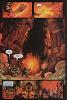
Seriously, spot Sasquatch in this picture.
Should be easy, hunh? He's the biggest one.
It isn't realistic. And these days, everything that's done is justified with 'realistic'.
We get it. You hate orange.
No. That's not my point. My point is, use it where it works, where it makes sense. Not every. Single. Time. Sometimes it works.  Like when it's meant to be post-Apocalyptic.
One of the problems, as Sasquatch just demonstrated, is that if it's used all the time, then it doesn't stand out when it's needed.
Oranges are a sometimes food
Come with me on a trip to an ice cream shop. Lets say my favourite flavour of ice cream is Bohemian Raspberry. I love the raspberriness of it, I love the crumblings of cake dough sprinkled throughout. I keep going to the shop that sells it the only shop that sells it. Then, one day, they discontinue it.
I keep going they have other flavours I like, caramel, chocolate, strawberry; but none that I like as much. Every once in a while, I ask if theyll bring Bohemian Raspberry back, but they tell me theres no demand. I know several other people who ask the same question, but ever since they changed the recipe, theres been no demand.
Then a Dennys opens up across the road, and they soon figure out that bacon is great. People love it. So they put it on everything.
Soon, the ice-cream shop branches out; it starts selling bacon, too. Bacon and eggs, bacon by itself, bacon waffles... and soon it figures out something obvious: if bacons great, and ice cream is great, together they must be simply wonderful!
I dont buy the bacon flavoured ice cream. I keep asking for ice cream without bacon, but it gets harder and harder to find. Ultimately, I have to look in one obscure corner. Theres bacon-free ice cream there, but its vanilla. Not the actually flavourful vanilla, either, but the plain ice cream that gets called vanilla. I buy it, and it even tastes great but only compared to the bacon-flavoured stuff thats all I can get. Bacon and chocolate, bacon and caramel, bacon and strawberry... Ugh. The flavours dont mix. Sure, there are a ton more varieties, but they all have bacon, and almost all of them are only a slight variant of bacon and caramel. did I mention that the bacon flavour completely overpowers the caramel, so that all youre getting is bacon, and you cant even taste the caramel anymore?
I notice how thin the crowds are getting at the shop, and how much more popular it was when it had the baconless ice cream I loved so much. They explain that its because of the Hooters that opened up a block away; its driving out their own business and Dennys. Its nothing theyre doing.
Then finally, they tell me what Ive been wanting to hear theyre bringing back Bohemian Raspberry.
Excited, I come in on the day... and its covered in bacon. This isnt what I wanted. Do you have it without bacon?
Certainly not. The server sniffs at me disdainfully. Theres no demand for it.
I look around at the half-empty store, and remember how crowded it was when they didnt sell just bacon. I look at the people behind me, saying they still love Bohemian Raspberry because they remember it without bacon.
I turn and walk away sadly.
Which actually involves whingeing loudly to whoever will listen.
You pitiful fool; dont you like bacon? is the only answer I can get.
Sure. I love it... but Im vegetarian.
I look at that vanilla in the corner, and wonder if its enough to keep me coming back to the shop.
It's the inverse ninja law: one ninja is unstoppable. A herd of ninjas is a pushover.
And there's nothing left for people who want bright, inviting colours. They hooked me with the good stuff, got my loyalty, and dumped me with this.
Actually, the photo above kind of demonstrates another favourite darkening trick of modern times; showing bright backgrounds, but keeping people's faces in shadow all the time. This one is more subtle, but it means that the part you most want / need to see is shaded. It's like a bad photographer taking all their pictures with the people backlit. (I never said I was a good photographer - but I'm not professional.)
What's missing? Two colours are conspicuous in their absence: green and white.
Whatever Apocalypse turned everything to a dry, dull orange killed all the plants. Look for green in a comic, I challenge you; the green of grass, of plants, of growing, living things. No, not algae and pond scum. Plants. (Which, technically, pond scum is
) Not green on costumes that were designed thirty years ago, but the green you see in the average forest. Or on a houseplant.
Even the costume green (or plant green) is darkened beyond recognition these days.
Sure, you get some white in the word balloons, but rarely in the actual artwork. It's rare even in the space between panels these days. Another favourite darkening technique is drawing everything on black paper (I believe that began with the backgrounds in Batman TAS; but it made sense there.)
Remember when Nicki at work told you about her art teacher telling her that there's no white in the real world? You know what they meant.
I do. That you have to leave room for shading. That there's subtle gradations all the time.
Counterpoints:
1. I don't know Nicki's art teacher. Why should I care what they say?
2. I'm not concerned with what some teacher calls realistic; I'm concerned with the feeling of warmth and invitation. Saying it's 'realistic' is the usual excuse to everything I dislike in comics; gloominess, nasty characters, depressing storylines, militarism, overreliance on 'science'
Why would I even want realism in superhero comics?
3. Whether it's skill or material that's lacking, when people try it, they never get it to look properly white. The subtle shading needed is just never there. (And, therefore, neither is that 'realism' they were talking about.)
4. The image will never be whiter than the paper it's printed on. Something as white as what you're looking at exists - by definition. Or by defenestration. So what's the point of even arguing there's no white?
A lot of the time the images are blurred together, and look really, really muddy.
Is this realistic? Inviting? Do you want to spend your life looking at that kind of colour scheme?
An experiment for those at home: take off anything that comes between your eyes and the outside world, and look around your room. Then look out your front door on a sunny day. If you need glasses to see with, this should work better; if all you see is colours. Note the dynamic range, note the amount of light, note the contrast. The real world does. Not. Wash its colours down to one shade of mud. It does not blur colours together the way comics do, with no real sharpness between them.
The only place it real life does that is under a muddy ol' river.
Who makes these things? Who lives like that?
Only a catfish could find this type of colouring realistic. Where do they get underwater comic shops? That's what I want to know! Do they keep ClanDestine under 'C'? (That under 'C' / undersea pun works better spoken. Which is not to say it works then, either.)
Worst case of Catfish Colouring I've ever seen!
I'm not gonna make a 'Mud-ern Colour' pun. But I will coin the term 'catfish colouring'.
In terms of mood, it's claustrophobic and depressing. Precisely what I don't want in my superhero comics; which should be bright and optimistic - or what am I reading for?
It's as if they're trying to find a way to artificially induce S.A.D. (Note that the treatment is light! Exactly what comics are losing.)
Sometimes the gloomy colouring suits the story! Didn't you say that it works for you when it's in the right type of story?
What have I ever said that would make you believe I want to read gloomy stories?
A part of the problem is that colouring is done on computer nowadays. The colours look way brighter there than on the final page.
 Too dull
Too garish - but it printed out great.
 I think it's possible.
This thread would indicate not.
Though they do insist on calling the style realistic right to the end, though one has the grace to put the word in quotes.
If this colour scheme looks realistic to you, get your eyes checked, or the lighting around where you live.
NB: this scene is outside. At day.
Such a stupid question.
Reasons:
1. This isn't about 'better'; I'm not saying any colourist lacks skill. I'm saying their choices are unappealing.
2. It isn't my job to do better. It is theirs - and as one of the people paying them to do it, I reserve the right to ask them to make it appealing.
3. Speaking of whose job it is: DC and Marvel can do better. They've been proving that for years.
4. It doesn't take a good colourist to recognise a bad one.
5. 
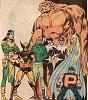
That's probably about the best I can do. (Also, look at the Masques book cover above.) This has a dynamic range of colour (ie: more than one).
Okay, it looks more orange and teal than it would if I'd done it today. But I didn't.
It isn't at all claustrophobic.
It has white. The colours are all similar because it shows similarly-coloured things, not because of 'bad lighting'. Which is what I'm asking for.
Not true of your book cover.
*Sigh*. True. But that isn't for a superhero comic; and I went through a lot of work to get it vibrant. It was dull and cold for a long time before I got it right (I had to work on it at home and print it out at work. It took a while).
True, it is only one colour; but a brighter one than most comics use these days.
So that's why I don't like the modern colouring style in comics.
It's easy to talk about what you don't like.
Yeah... yeah, it is.
So what do you like?
Easy!
So why don't you buy comics that are more like that?
I told you - nobody's making them. The new JLI and Green Arrow... maybe. (NB... since I first wrote this, Green Arrow got dull, and JLI got cancelled. Young Avengers is looking good, and Wolverine and the X-Men.) I don't want to give up on comics, but it's getting really hard to find anything I can relate to - and the colour schemes are a big, if subliminal part of that.
Can we please have a return of the bright style of the 70s and 80s, so I can have a comics world I want to visit?
P.S. colour is a perfectly cromulent spelling in Australia. And the UK.


 Reply With Quote


